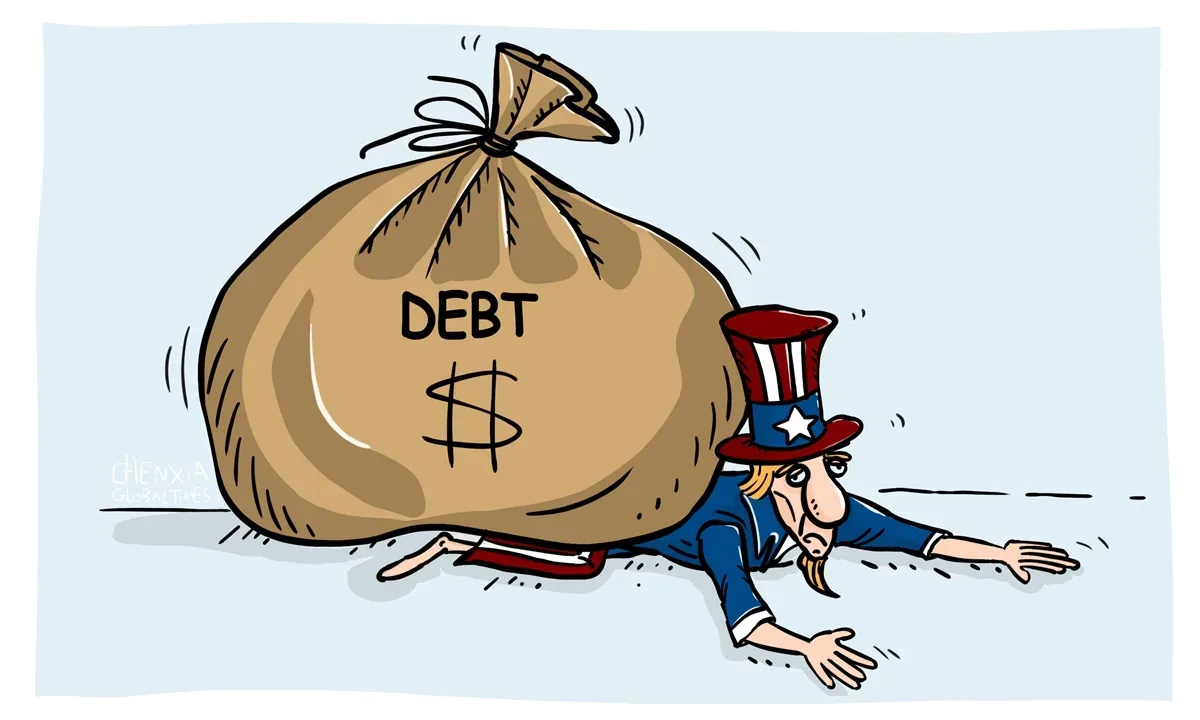
The Neighbor Who Manages Your Retirement
Your neighbor lives in a nice house, drives a new car, and spends 35% more than they earn every year, with credit cards covering the difference. They also manage your retirement, your healthcare, and your kids’ futures. That’s America’s federal balance sheet in 2024.
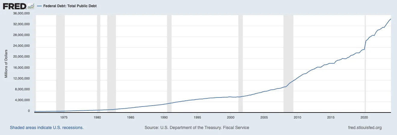
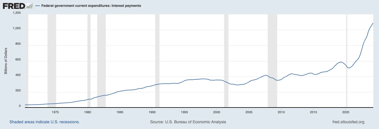
Our federal debt has exploded from $22.7 trillion in 2019 to $34.1 trillion in 2024. A staggering 50% increase in just five years. The total gets the headlines, but the line I keep coming back to is interest, which has more than doubled from $375 billion in 2019 to $870 billion in 2024. A balance can sit on the books for decades without hurting anyone. Interest is the bill that comes due every single year, whether Congress votes on it or not.
The Tail Wagging The Dog
None of this was inevitable. The path here was paved by decisions that looked rational in isolation and turned into a perfect storm once you stacked them. The story starts with the era of zero interest rates, a period that changed how we think about debt and spending.
Following the 2008 financial crisis, the Federal Reserve kept interest rates near zero for an unprecedented length of time. That policy helped stabilize the economy while the crisis was live, and it also created what economists call “moral hazard”: a government that got used to borrowing with virtually no immediate consequences.
Like a family taking advantage of 0% credit card offers without planning for when those rates expire, the federal government accumulated massive debts while interest costs remained artificially suppressed.
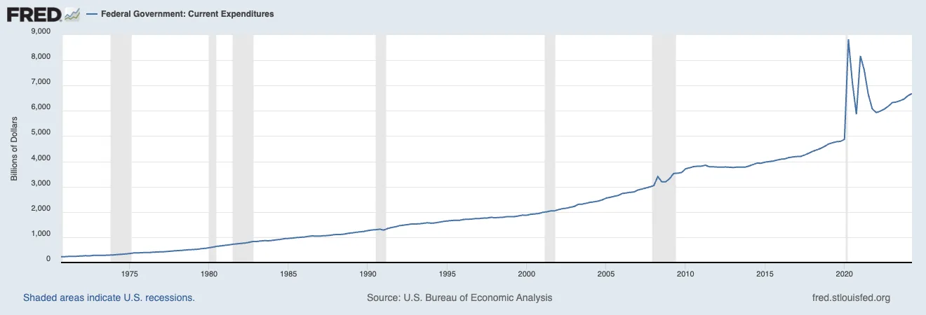
The Federal Reserve Economic Data (FRED) charts tell this part clearly. The federal expenditure line climbs steadily, then accelerates hard around 2020. Pandemic spending accounts for the spike, but the slope started before it and never came back down. Trillion-dollar deficits became the baseline, even in growth years, and honestly, that baseline worries me more than the spike.
Which brings us to the most troubling piece of the whole situation: the debasement of our currency through the most aggressive money printing in history. When the government needs money beyond what it collects in taxes, it has two options: borrow or print. Increasingly, we’ve chosen both, borrowing massive sums while creating new money to help manage the debt burden. Politically expedient? Sure. The bill for it is now showing up in both inflation and rising interest rates.
Understanding the Numbers
To grasp the true scale of this, let’s translate the government’s finances into terms we all understand: a household budget. In 2024, the federal government expects to collect $5.1 trillion in revenue while planning to spend $6.9 trillion. Using our household analogy, that’s a family earning $51,000 a year while spending $69,000 and putting the missing $18,000 on credit cards.
But here’s the problem: $870 billion of the government’s annual spending goes solely to interest payments. In our household example, that’s like spending $8,700, or 17% of your annual income, on credit card interest.
Just to stand still.
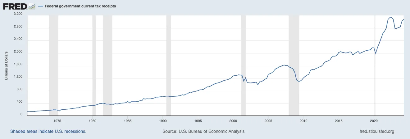
How long could your household run like that? Tax receipts (our national income) have grown, but spending has consistently outpaced them. More troubling is the recent vertical climb in interest payments. A curve that looks eerily similar to what credit counselors would call a “debt spiral.”
The Ticking Time Bomb
Beneath these already alarming numbers sit two bigger dangers. The first is our debt’s maturity structure, meaning when our loans come due. A significant portion of government debt must be refinanced in the next few years, under very different conditions than when it was first borrowed.
Remember that zero-interest-rate era? Well, the government loaded up on debt at historically low rates, and now, as those debts get rolled over, they’re being refinanced at rates three to four times higher.
Same debt, new price.
Think of it like an adjustable-rate mortgage that’s about to reset, except on a $34 trillion scale. The FRED interest payment chart shows the beginning of that reset, with payments rising almost vertically as higher rates begin to bite. A temporary spike would roll over and fade. This one reads like the start of a structural shift that could dominate our national finances for decades.
That reset is what kicks off the classic debt spiral. Inflation rises as our newly printed capital diffuses through the economy (more money in the economy), and the cost of everyday goods and services climbs with it. To fight that inflation, the Federal Reserve has to raise interest rates to cool the red-hot economy. Higher rates push borrowing costs up, which adds to the annual debt, which returns us to the two ways of covering the gap → borrowing or printing. We don’t want to print because of inflation, and borrowing has become too costly. That leaves us between a rock and a hard place.
The second danger is demographic. As Baby Boomers continue retiring, Social Security and Medicare obligations are set to increase dramatically, piling more pressure on an already strained system. And it’s happening now, which the steady rise in federal expenditures already shows.
The Structural Challenge
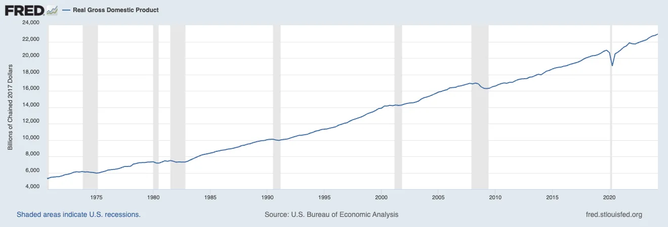
What makes this dire is the structure of it. A temporary emergency resolves itself once growth returns; this one keeps compounding whether growth shows up or not. In previous periods, interest payments stayed relatively stable or grew gradually. Now we’re seeing an exponential increase that threatens to consume an ever-larger portion of the budget. 2024 alone should see roughly 13% of our budget going to interest payments.
Thirteen cents of every dollar spent.
The math is simple but brutal: when interest payments grow faster than tax revenues, an ever-increasing share of national income must go toward servicing debt rather than providing government services. Higher debt leads to higher interest payments, which leads to more debt, and so on. A vicious cycle, and it’s already turning. I don’t see current growth outrunning it.
Looking Forward & Paths to Sustainability
Is there a way out? A narrow one. Like a household facing serious credit card debt, the fix needs some combination of more income, less spending, and smarter debt management. The scale and complexity of federal finances make each of those far harder than a household budget adjustment.
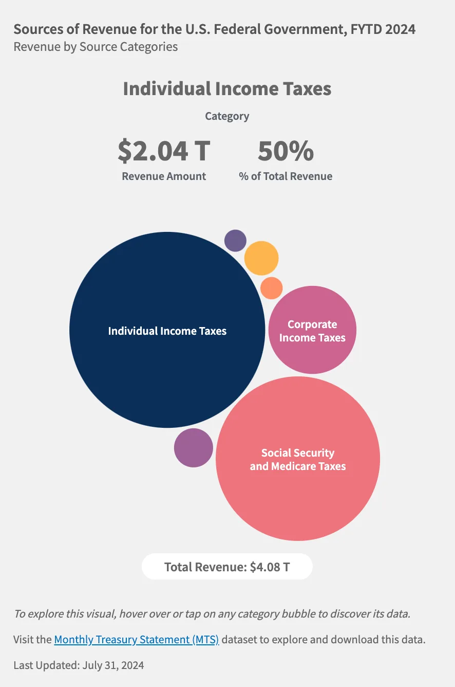
First, revenue. The federal government’s tax receipts sit at historically high levels and still haven’t kept pace with spending growth. Receipts show periodic peaks and valleys, but the overall trend hasn’t matched our expenditure growth, and any serious solution has to close that gap through economic growth, tax policy changes, or likely both.
On the spending side, the challenge is even more daunting. A household can simply cut back on discretionary purchases; the federal government has far less room, because roughly 70% of federal spending is considered “mandatory”, including Social Security, Medicare, and interest payments. The remaining 30% covers essential services like national defense, infrastructure, and research. So who gets told no? There’s no painless way to close a $1.8 trillion annual deficit. We’re going to have to get very creative to address this issue.
Where This Path Ends
The strongest case against everything above is a good one. The United States still holds its prime credit rating, and the dollar is still the world’s reserve currency, which lets America roll this debt on terms no household could get. Your neighbor’s card gets declined eventually. Washington’s keeps getting a higher limit, as long as the rest of the world keeps wanting dollars.
Both of those buy time. Both of them also assume the privilege holds, and BRICS nations are already testing that assumption. How long does that privilege hold with the charts above pointed the way they are? I don’t know, and I’m not convinced anyone in Washington does either.
So here’s my read of the FRED data: the current path is unsustainable. Exponential growth in both total debt and interest payments, stacked on structural deficits and a retiring generation, points to a future of increasingly difficult choices. Fixing it takes political courage and a public that can do the household math above, which means a national conversation about fiscal sustainability that gets past partisan talking points. Every fix on the table costs someone something they were already promised, which is exactly why none of them get made.
The charts show where this path ends. Your neighbor is still spending 35% more than they earn, and they’re still managing your retirement.
Appendix
The last 25 years of debt: